
OBJECTIVE
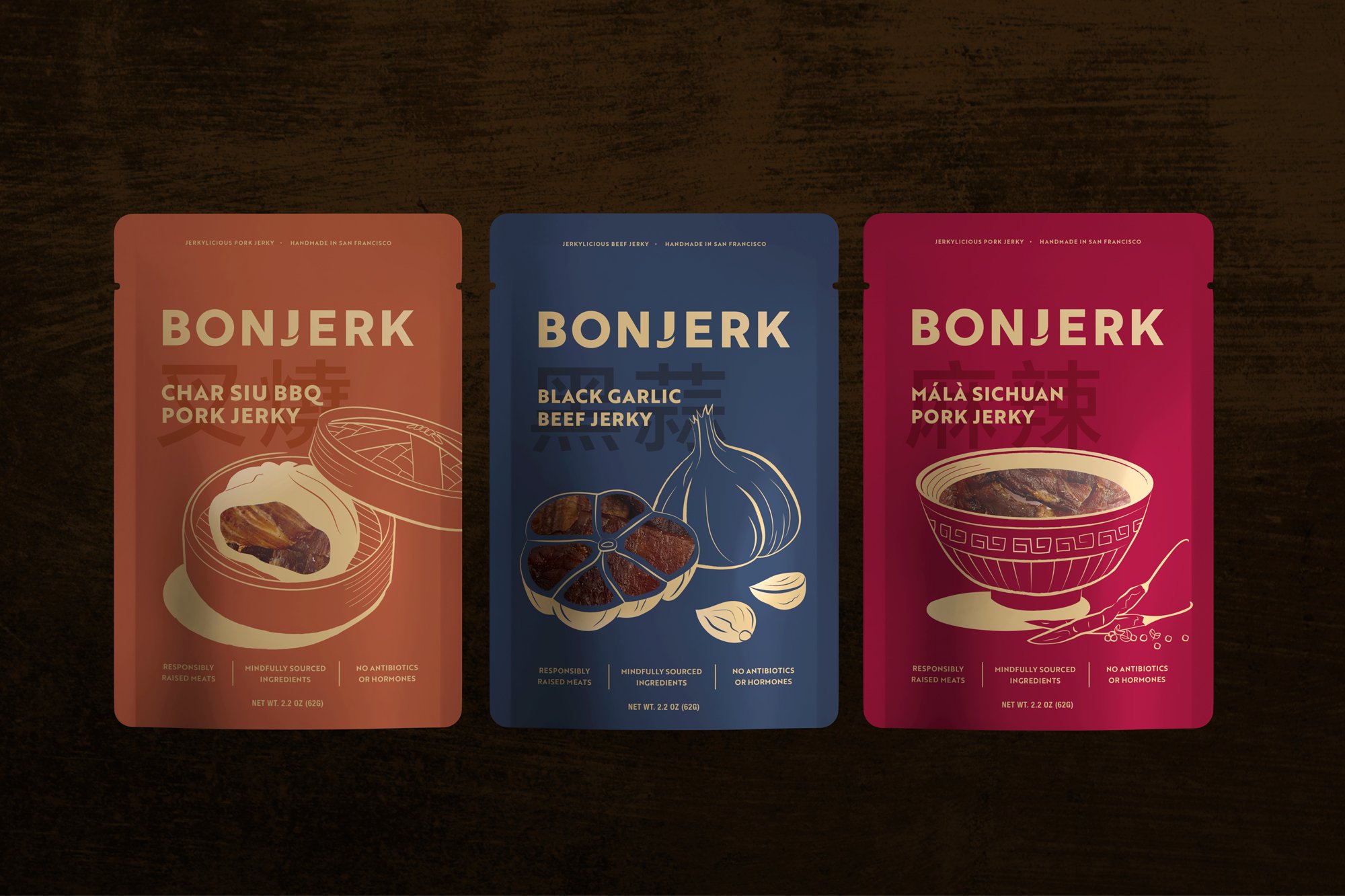
Bonjerk wanted to build a sophisticated brand to launch their new jerky company. The Asian-spiced jerks were inspired by beloved East Asian dishes like char siu bao and mapo tofu. The goal was to give a nod to its inspired dish, while making clear that the products were jerky.
SOLUTION
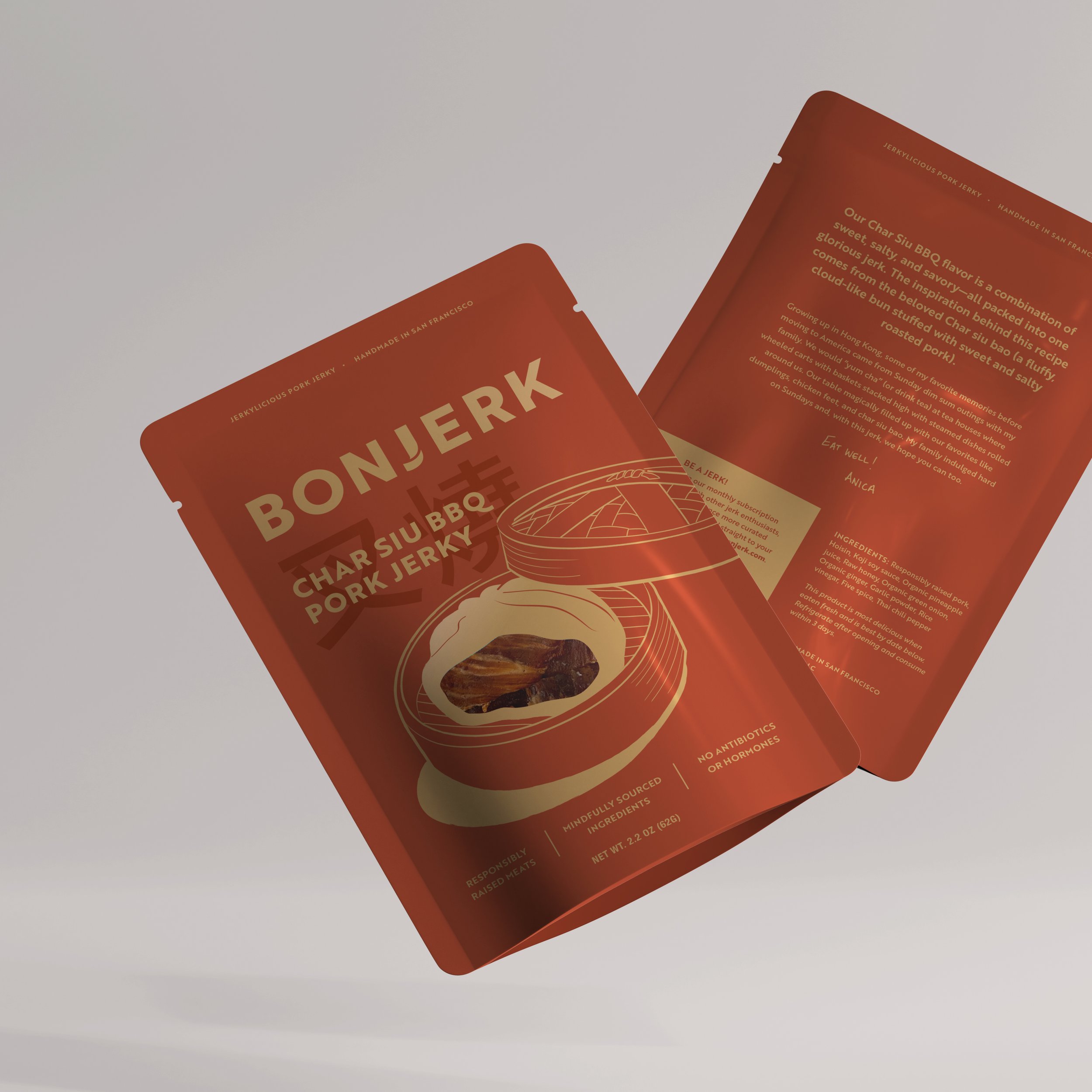
We decided to be classic and subtle with the overall branding and add character through illustration. The distinct J in the logotype was inspired by jerky fibers and we incorporated rich colors with copper tones. The juxtaposition of the illustration and the real jerky (visible through the clear windows) allowed consumers to quickly connect the two - that the jerks were inspired by these dishes.
Logo & Brand Design, Packaging


"We worked with Lisa to help build Bonjerk’s logo and packaging, and what she created was beyond what we could have ever imagined. From the elegant workflow, to her ability to understand feedback and manage deadlines, allowed for a relaxed and collaborative experience. Her commitment to making our project exceptional was never lost throughout the process. We’re excited to continue our work with Lisa as we grow our business!"
— Anica Wu, Founder of Bonjerk
MORE

Little Burde Chocolate

Uproot Teas

Leah Rosenberg