

OBJECTIVE
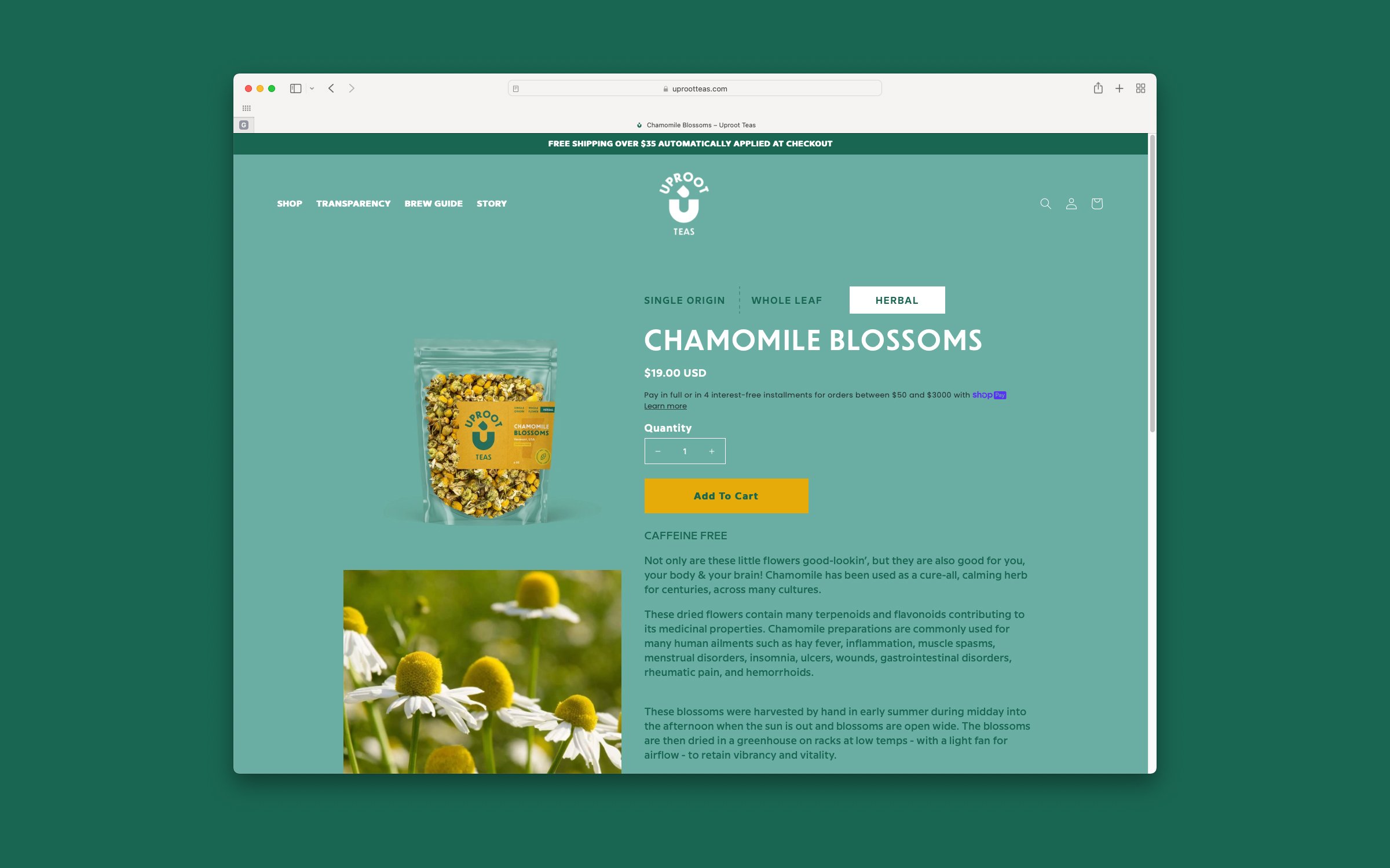
Uproot Teas specializes in premium, single-origin, whole-leaf teas sourced ethically from farms. Cindy wanted to build a brand that highlighted the company’s values of transparency and zero waste. With the target audience of Millennial & Gen Z conscious consumers in mind, it was important to build a trustworthy, yet equally fun brand presence.
SOLUTION
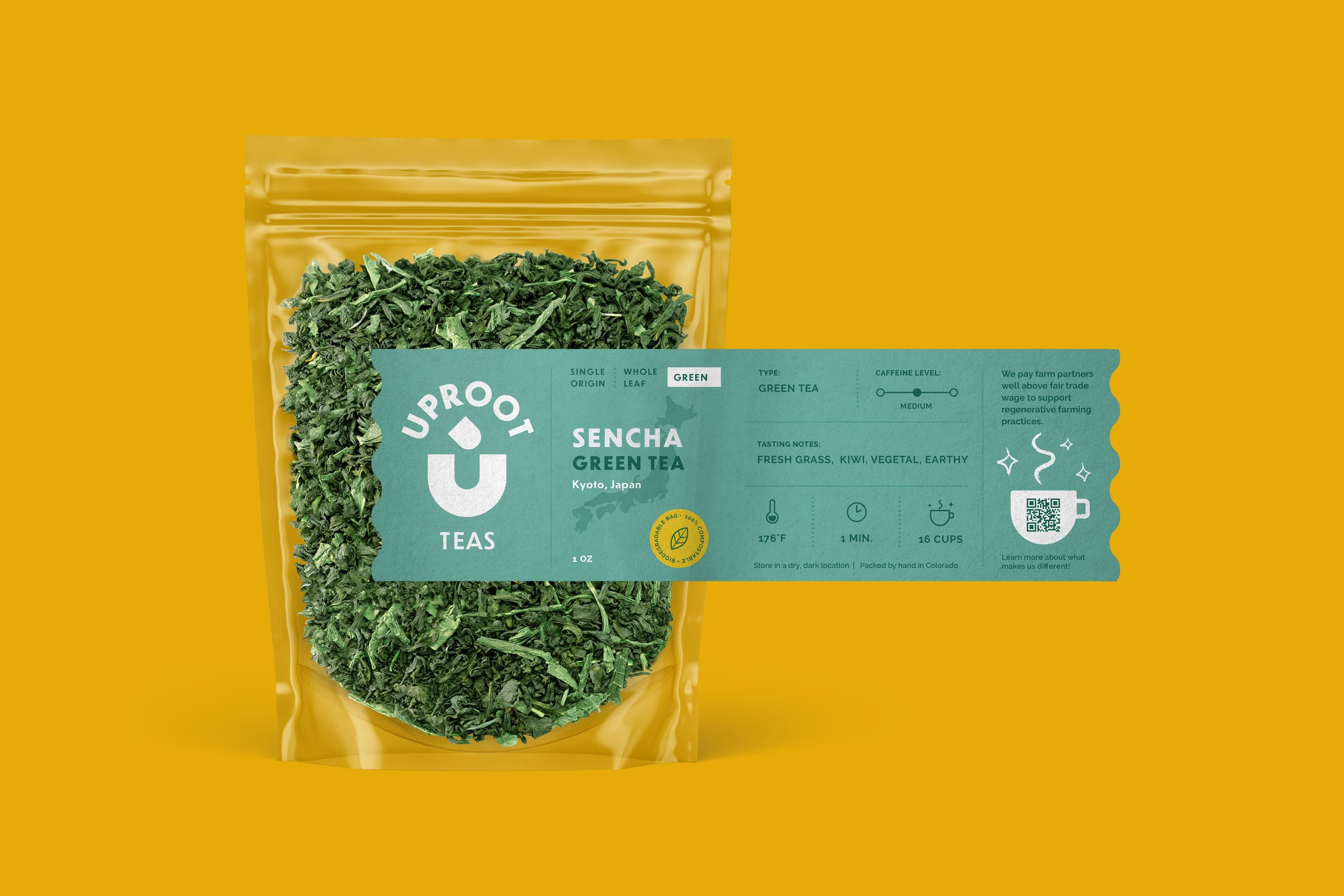
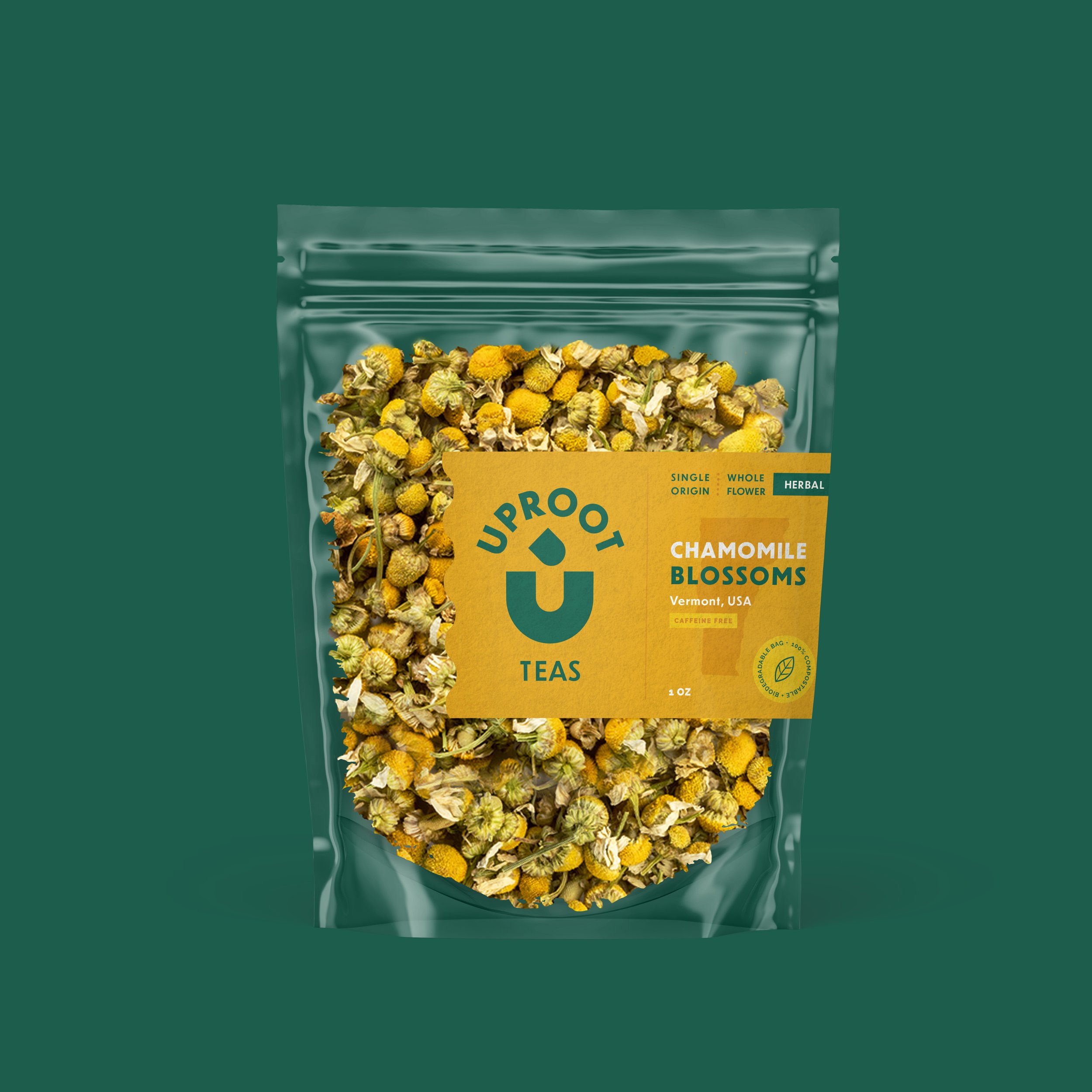
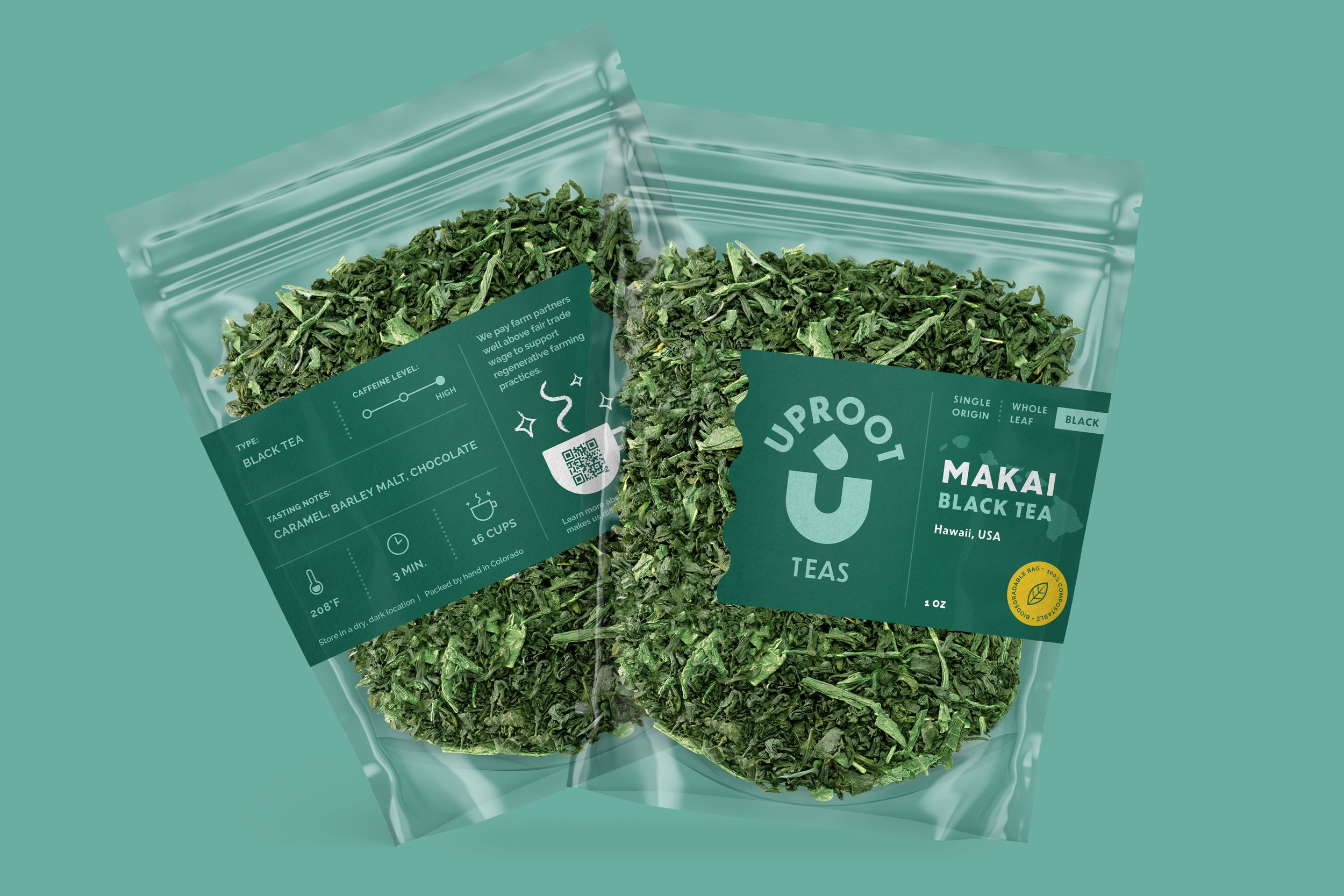
Simple. Honest. Bold. The logo mark U is formed by its center being uprooted. The tilted accent suggests a cup. The colors are grounded with dark green and turquoise, with pops of vibrant yellows.
While we considered glass for a more premium look, we ultimately decided on compostable clear pouches for a smaller carbon footprint. The leaves are clearly visible and we highlight the origin of the tea with a silhouette behind the product name.
Logo & Brand Design, Packaging, Website

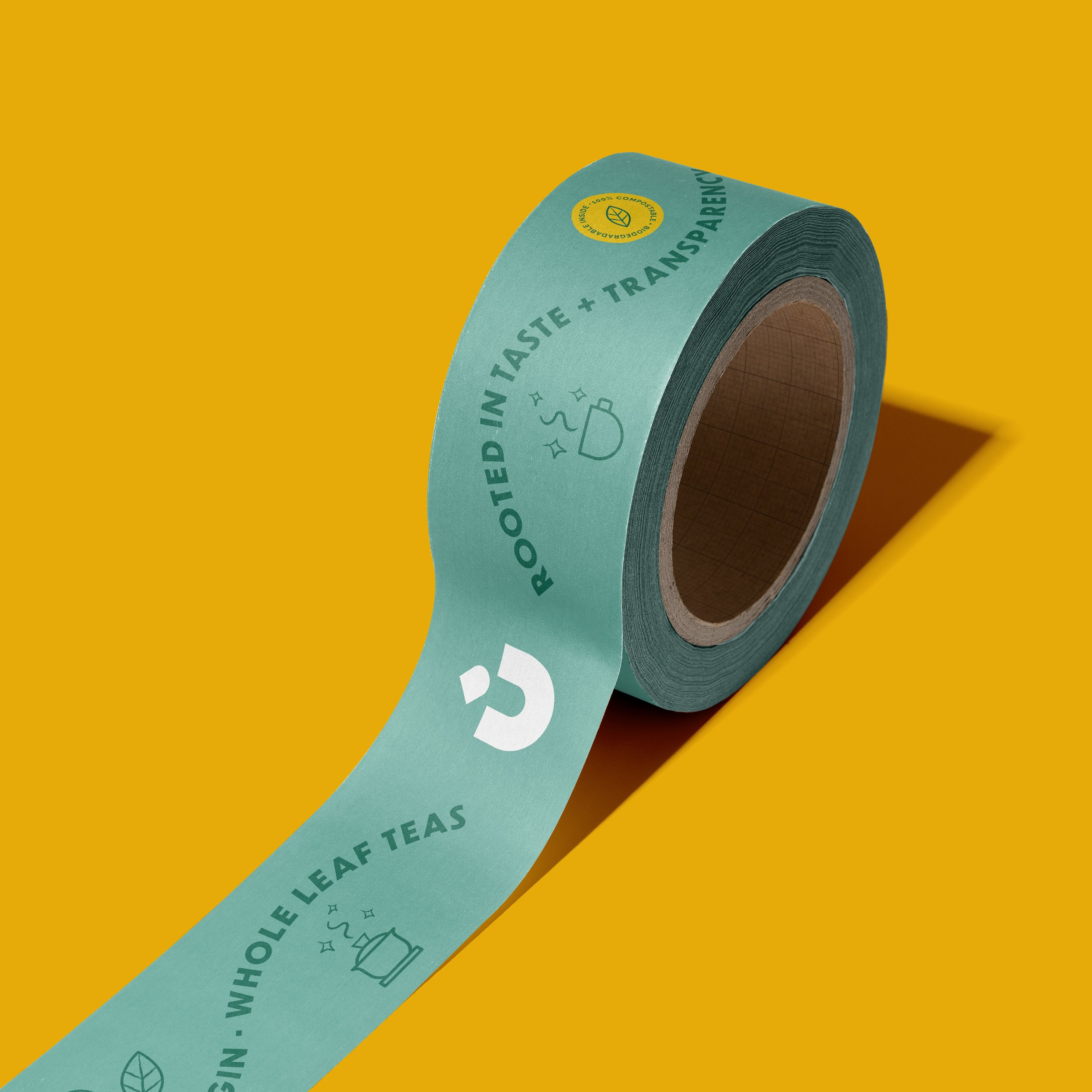
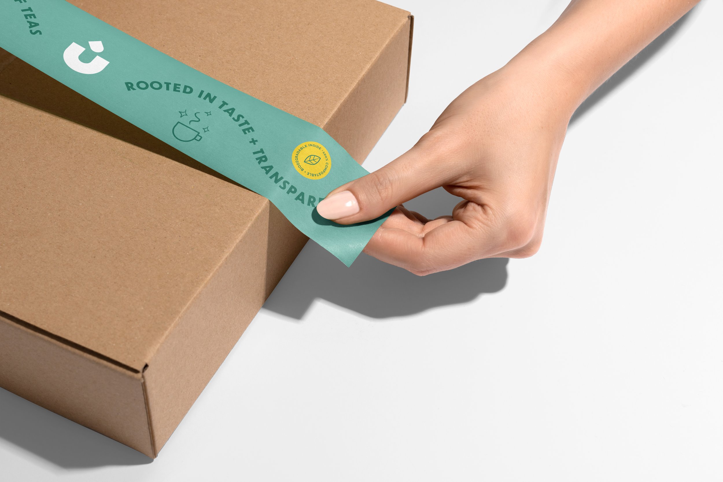
“We’re uprooting the antiquated tea trade by bringing transparency to our sourcing, pay, and sustainability with our whole leaves.”
"I loved working with Lisa to create my brand system, packaging, and website designs. She is not only a great designer, but she is a true joy to work with. She listens well and works hard to understand your vision and what you want to communicate. Then, every time we met, she provided amazing options and helped push my creative vision beyond what I could have come up with myself. I was blown away at each meeting. I would love the opportunity to continue working with her!!"
— Cindy Li, Founder of Uproot Teas
MORE

Afar Foods
Bonjerk

Little Burde Chocolate