

Rootstock is about fueling for peak performance and optimal health through smart nutrition. Their first product, Power Oats, aims to provide high-quality breakfast for those with limited time, looking to improve their health.
Upon discussing Rootstock's immediate needs and long term vision of creating an ecosystem around functional food and wellness, we designed a brand identity that's grounded in their values, with enough flexibility for the brand to grow into their larger vision.

BRANDING
To convey a strong, holistic and innovative brand, we created a logo that reflects growth, balance, and performance. The graphic stems from the concept of micro (magnifying to reveal the science behind it) and macro (zooming out, thinking holistically). The italic modern typography evoks movement while feeling grounded.
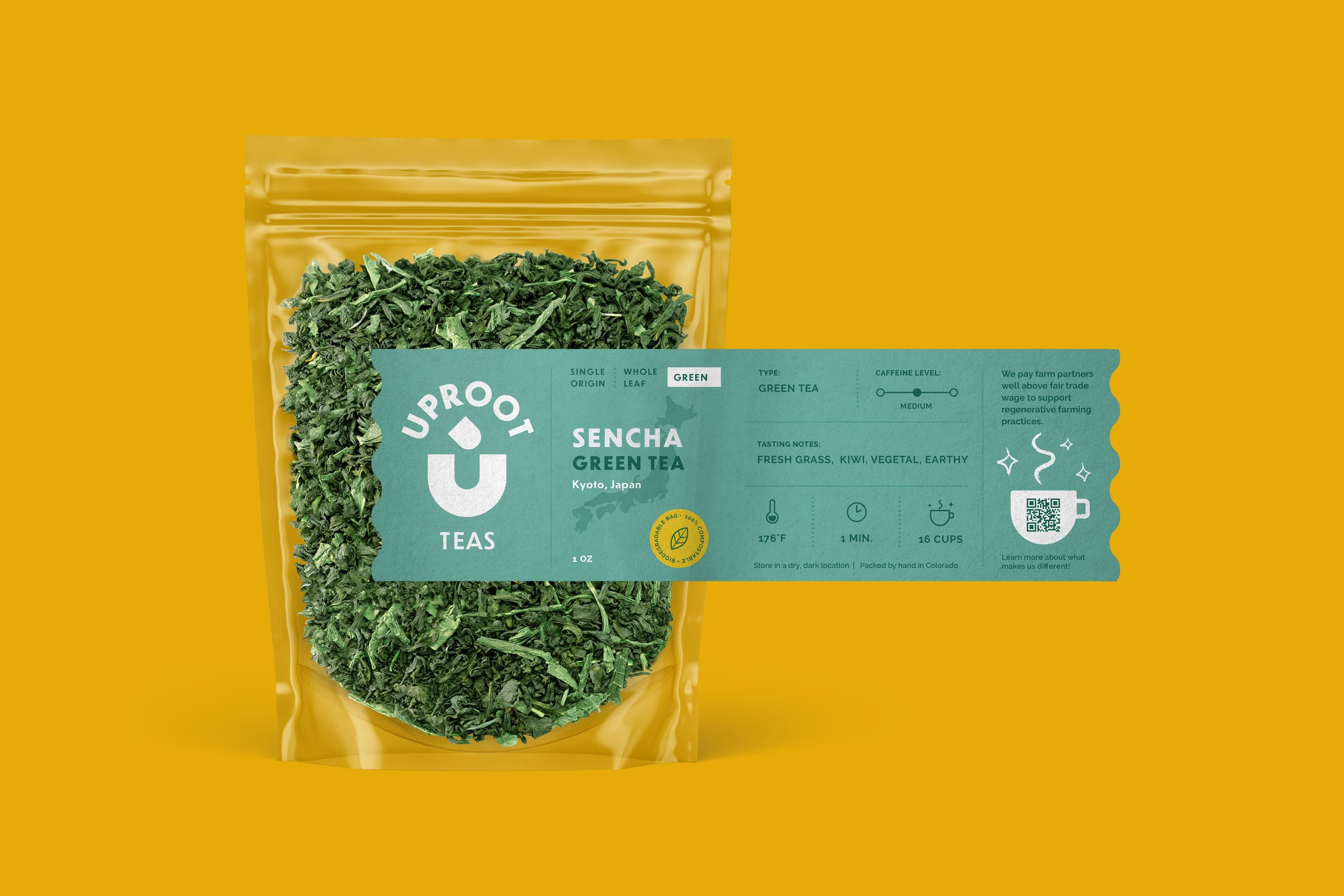
PACKAGING
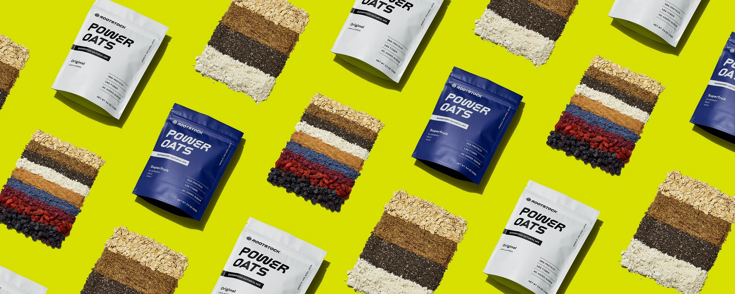
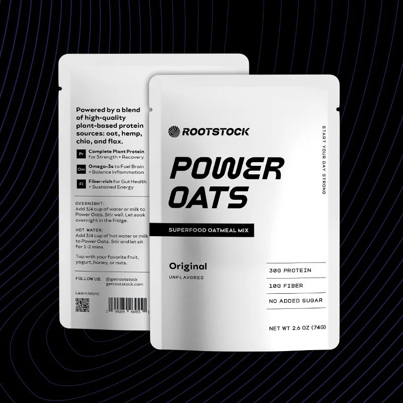
We lean into performance with minimalism, where the typography takes center stage. Designed for functionality, key callouts like protein, fiber content, and ingredients are displayed on the front.
WEBSITE
As a brand new start-up, starting with a Shopify template made the most sense. On the landing page, we guide users through the WHY behind Power Oats through concise messaging and graphics. Simplicity was the goal for an easy to digest user experience.
Client: Rootstock
Design: Lisa Mishima
Photography: Melati Citrawireja, Photo Art Direction: Sharm


"We reached out to Lisa because of her previous work which we really loved. Her extensive knowledge and experience in the food and beverage space really helped us navigate nuances and focus on what’s most important to our brand and product.
Lisa was able to synthesize our ideas into actionable results. She’s a pleasure to work with and on top of her game. I would highly recommend Lisa for any CPG/food branding, packaging, and website design project!"
— Kim Tran and Trent Turner, Founders of Rootstock
MORE
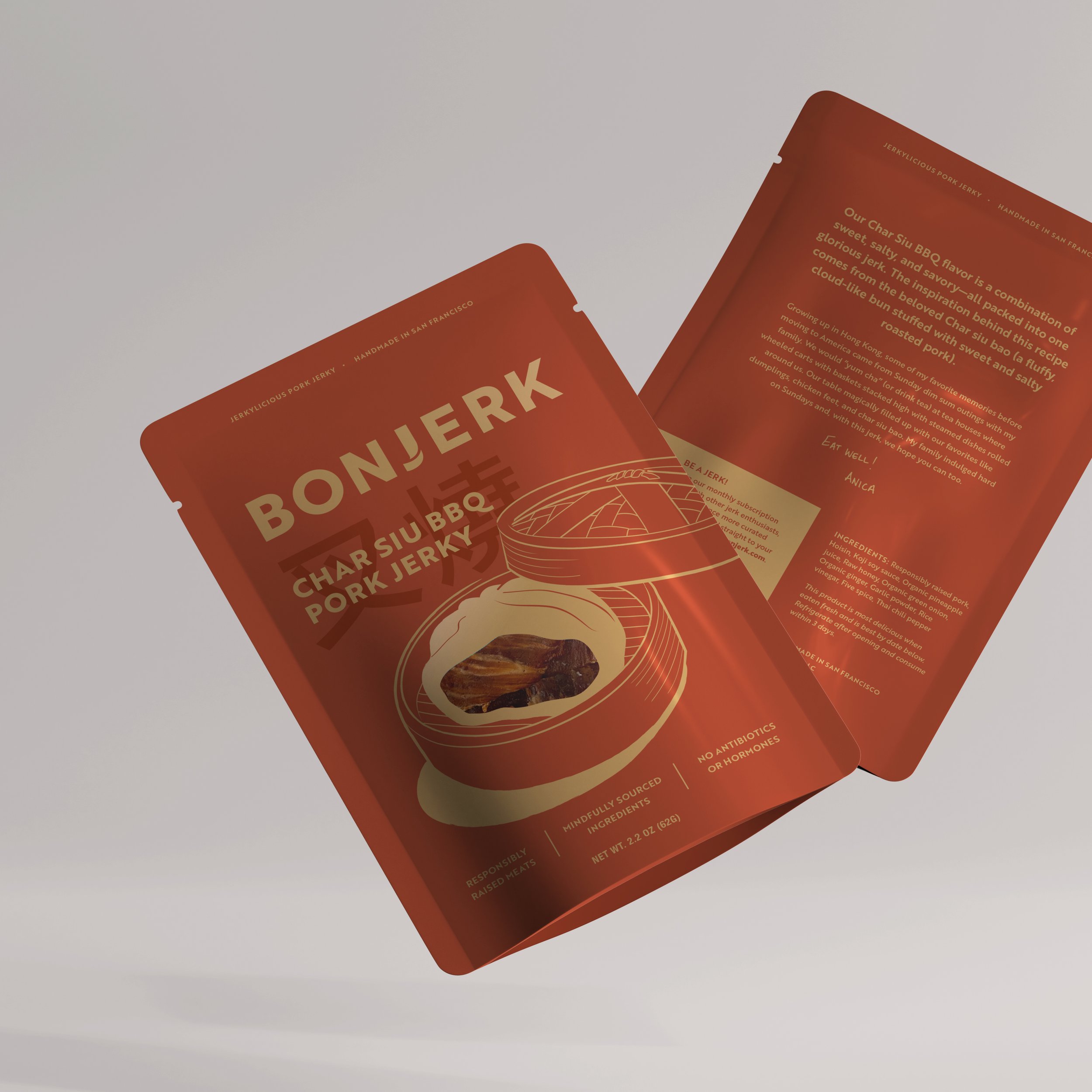
Bonjerk
Uproot Teas

Little Burde Chocolate